Packaging & Collection Design
Simply Coil
A Jar Worth Leaving on the Vanity
- Client
- Simply Coil
- Year
- 2026
- Role
- Packaging and collection-page design
- Deliverables
- Label artwork and collection-page mockup
The Problem
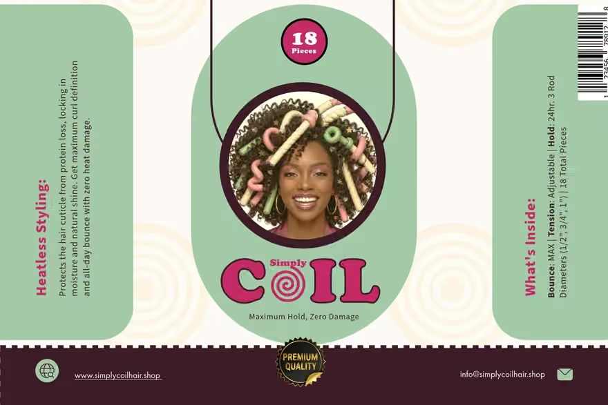
Start with the jar. The brief was for women with 3C to 4C coils who wanted a heatless styling option. We wanted something that would make sense beside the things they already reached for at the mirror.
The Thinking
The pastel rods were already the most interesting thing in the room. Clear glass would let them show through. Rounded lettering and a wide lid gave the jar the feel of something you might keep on a 1970s vanity.
The Decision
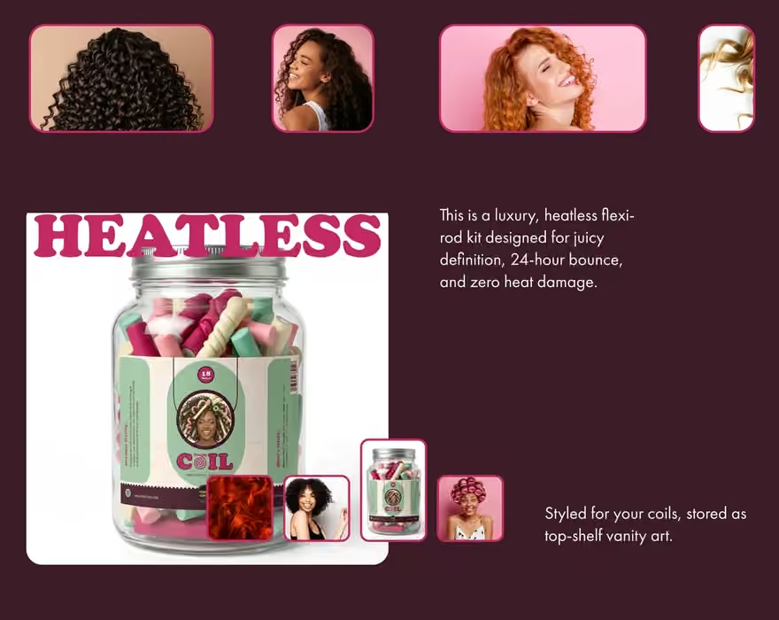
A good-looking jar can get someone to pick it up. Asking it to teach them how to use a flexi-rod was a bit much. We gave the routine card that job and used the collection page to show how the product fits into a heatless styling routine.
The Outcome
The same plum, pink and rounded lettering carried from the label into the collection-page mockup. Put the label and the page beside each other and you can see how the design tells someone what they are choosing and what to do with it.
