Introduction:
- Any text on this website can easily be changed by clicking on it and editing it as needed in the editor panel that opens on the left. You can also follow this short tutorial
- Any image on this website can easily be replaced by clicking on it and editing it as needed in the editor panel that opens on the left. You can also follow this short tutorial
-
HERO
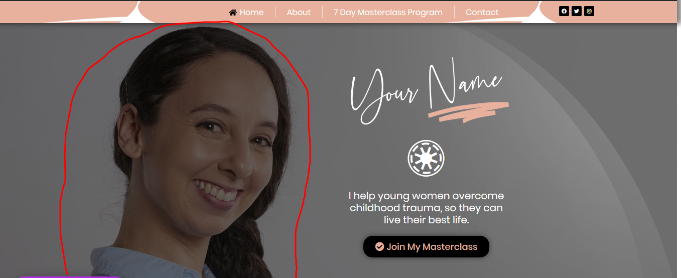
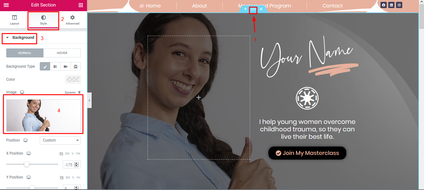
If you would like to change the image of the lady here shown in the hero section (A hero is a large web banner that your visitors first see when they visit your website):
- Hover your mouse over the top of the hero section and click on the section handle
- The section editor panel will automatically open the left
- Click on STYLE
- Click on BACKGROUND
- Click on the image to be able to select a new one from your media library or from your computer
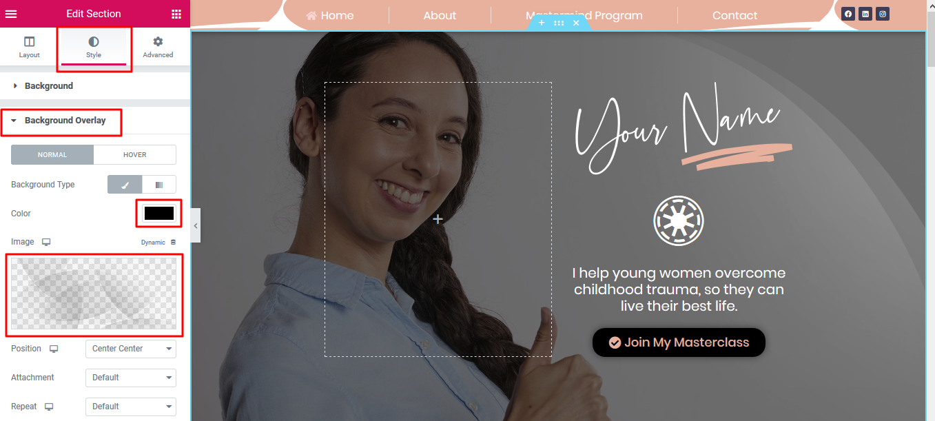
2. Hero Overlay Properties
- The image has a dark grey overlay picture and a black tint to help make the white text stand out
- You can change the overlay to another picture/color if you wish
- To change the overlay picture/color simply click on BACKGROUND OVERLAY(background overlay is just below BACKGROUND)
- Click on the color box and begin adjusting the colors as needed
3. Animated Headline
- This is an Animated Headline and you can change its color in the STYLE TAB
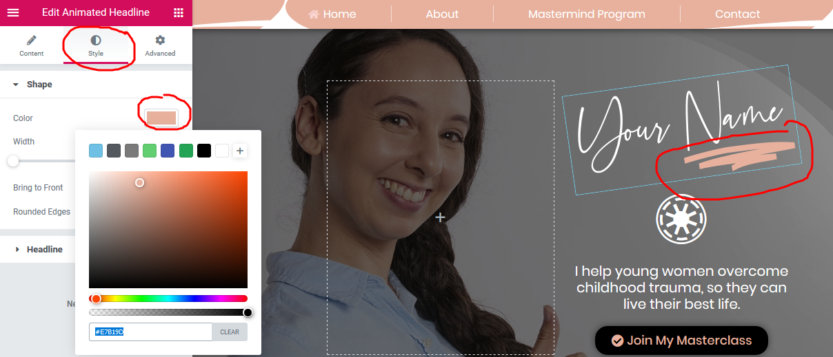
Here are all the options that you have for your Animated Headline
Style: Choose Highlighted or Rotating style
If Highlighted style is chosen, the following options become available:
- Shape: Choose the shape of the highlight, including Circle, Curly, Underline, Double, Double Underline, Underline Zigzag, Diagonal, Strikethrough, and X
- Before Text: Type the headline text that will appear before the highlighted text
- Highlighted Text: Type the text that will be highlighted
- After Text: Type the headline text that will appear after the highlighted text
- Alignment: Set the alignment of the headline, Left, Center, or Right
- HTML Tag: Set the heading’s HTML tag to H1- H6, Div, Span or Paragraph
If Rotating style is chosen, the following options become available:
- Animation: Choose the animation of the rotating text including Typing, Clip, Flip, Swirl, Blinds, Drop-in, Wave, Slide, and Slide Down
- Before Text: Type the headline text that will appear before the rotating text
- Rotating Text: Enter the list of rotating text, in the order of rotation
- After Text: Type the headline text that will appear after the rotating text
- Alignment: Set the alignment of the headline, Left, Center, or Right
- HTML Tag: Set the heading’s HTML tag to H1- H6, Div, Span or Paragraph
Style
Shape (option only available if Highlighted type is chosen)
- Color: Choose the color of the highlighted shape
- Width: Set the width of the highlighted shape
- Bring to Front: Slide to Yes to Bring the shape to the front
- Rounded Edges: Slide to Yes to round the edges of the shape
Headline
- Text Color: Choose the color of the headline’s before and after the text
- Typography: Set the typography options for the headline’s before and after the text
Animated Text
- Text Color: Choose the color of the animated text
- Typography: Set the typography options for the headline’s animated text
4. Icon
This is an icon
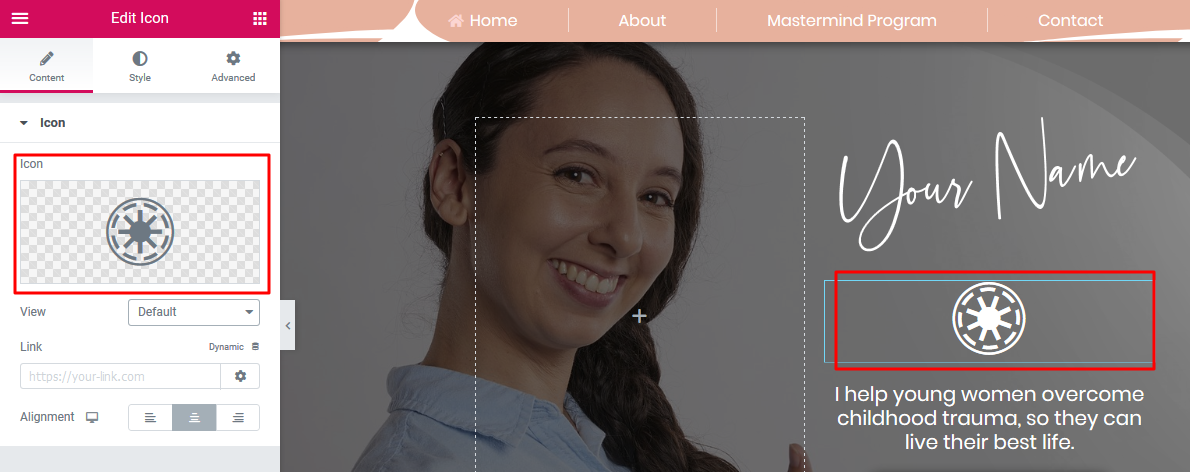
And here are the options you have for the icon:
There are 3 different views for the widget: Default, Stacked and Framed. If the Default view is chosen, the following options are available:
Content
- Icon: Choose from a list of Font Awesome icons
- View: Choose between default, stacked or framed
- Link: Enter the URL for the item’s link. Click the Link Options cog
 to either add rel=nofollow to the link or to open the link in a new window.
 - Alignment: Align the icon to left, center or right.
Style
Icon
Normal
- Primary: Choose the main and secondary colors for the icon
- Size: Increase or decrease the size of the icon
- Rotate: Rotate the icon
Hover
- Primary Color: Set colors for the hover
- Hover Animation: Set any animation for the hover state
- Size: Set the exact size of the icon
- Rotate: Rotate the icon up to 360 degrees
If Stacked or Framed view is chosen, the following options are available:
Content
- Icon: Choose from a list of Font Awesome icons
- View: Choose between default, stacked or framed
- Shape: Choose the shape of the stack or frame, either Circle or Square
- Link: Enter the URL for the item’s link. Click the Link Options cog to either add rel=nofollow to the link or to open the link in a new window.
- Alignment: Align the icon to left, center or right.
Style
Icon
Normal
- Primary Color: Choose the primary color (the background or frame) color for the icon
- Secondary Color: Choose the secondary color, which is the color of the icon itself
- Padding: Set the padding around the icon to control the size of the stack or frame
- Size: Set the size of the icon.
- Rotate: Rotate the icon up to 360 degrees
- Border Radius: Set the border-radius to control the corner roundness of the stack or frame
Hover
- Primary Color: Choose the primary color (the background or frame) color for the icon
- Secondary Color: Choose the secondary color, which is the color of the icon itself
- Hover Animation: Choose an animation effect when hovering over the icon, such as Grow, Pulse, Skew, etc.
- Padding: Set the padding around the icon to control the size of the stack or frame
- Size: Set the size of the icon.
- Rotate: Rotate the icon up to 360 degrees
- Border Radius: Set the border-radius to control the corner roundness of the stack or frame
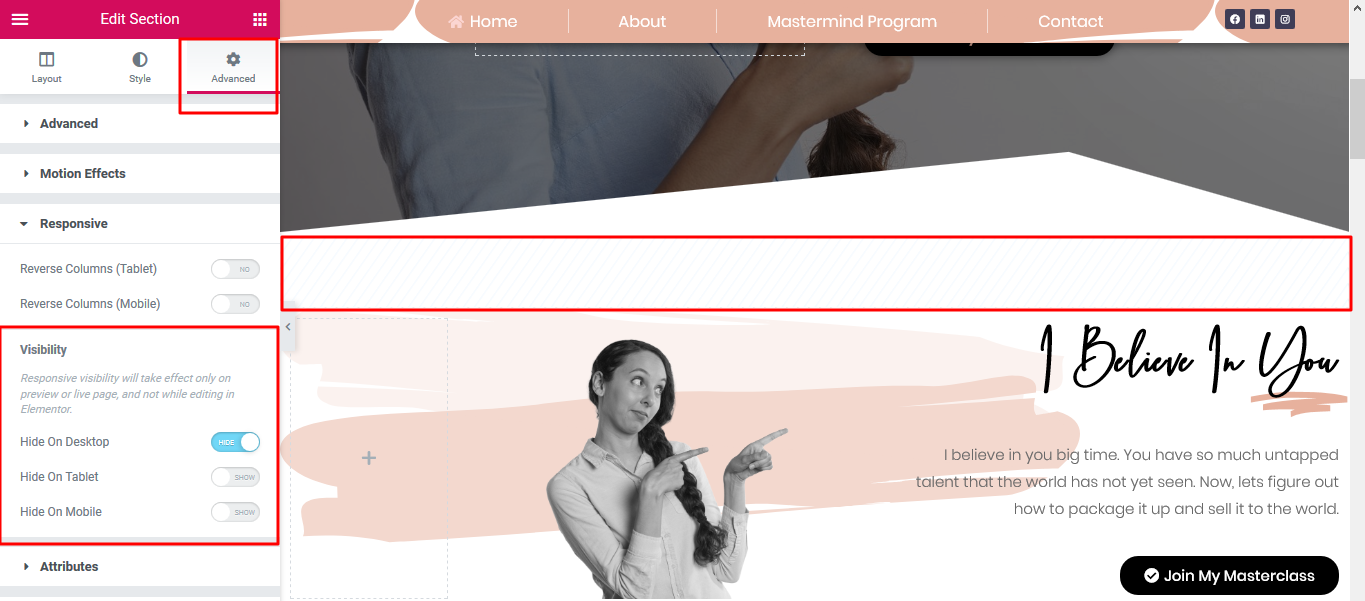
5. Any element that has is faded out and has these lines on top of it is set to 'hidden'
- For the sake of maintaining good responsiveness, you can choose to hide/unhide any element based on device
- In the example below, the highlighted section is set to be hidden from users who are viewing the website using a desktop
- But those using tablet/mobile devices can see that section
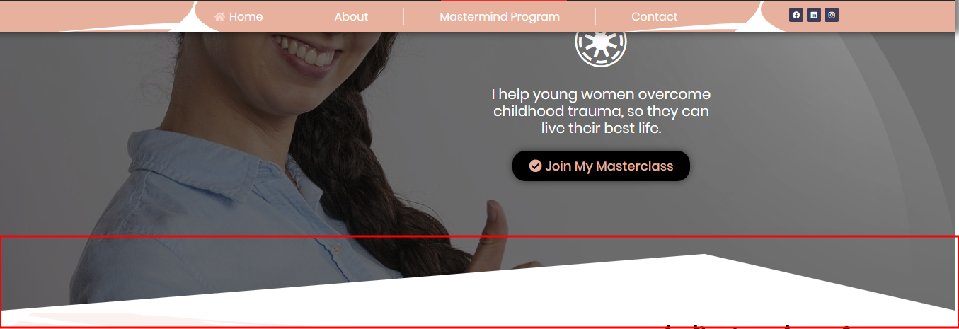
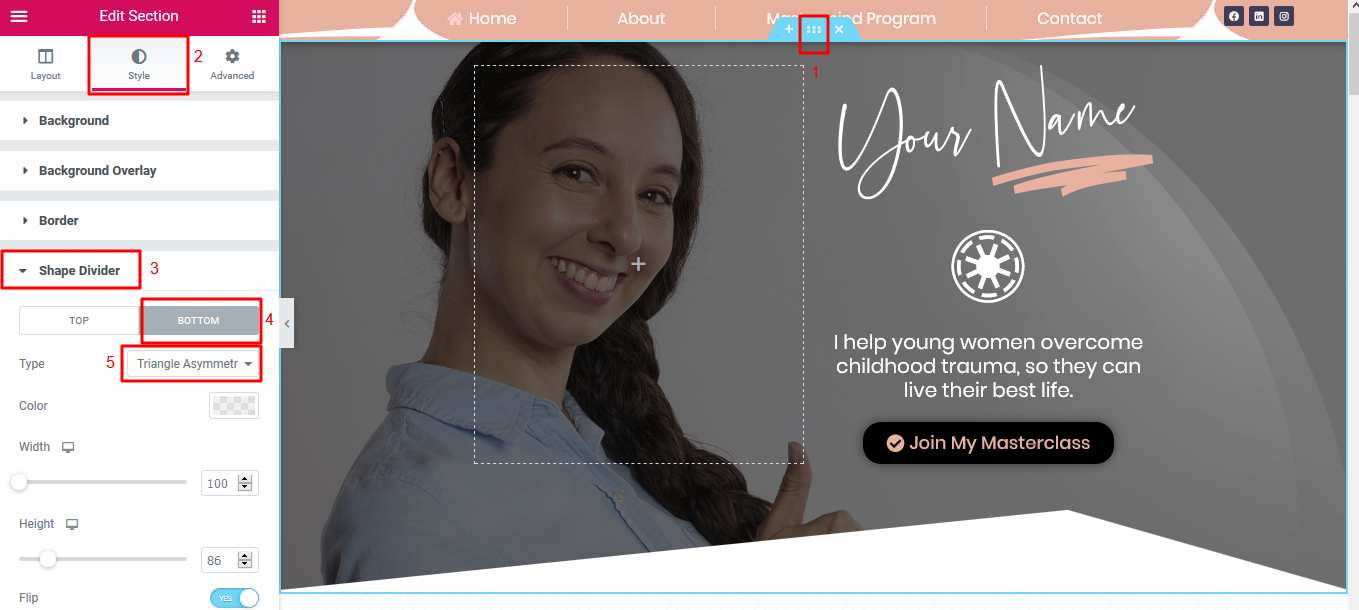
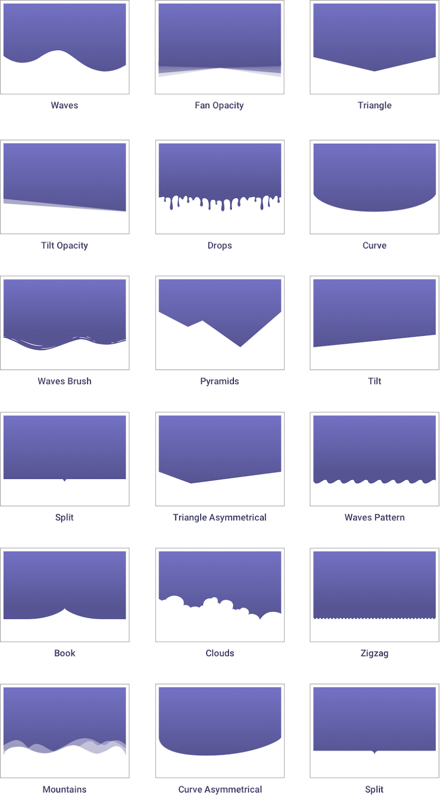
5. Shape Divider
- This shape highlighted below can be easily removed/straightened out or edited as needed.
- It is called a section 'Shape Divider' and this type of divider is very common on almost every page of the website.
How To Edit Shape Dividers
- Hover over the top of the Section where the shape divider is
- Go to > Style > Shape Divider
- Choose to display at the Top or Bottom of your section
- Type: Click the dropdown to choose your Shape Divider style
- Color: Pick a color
- Width: Set the width of your Shape Divider
- Height: Set the height of your Shape Divider
- Flip: Flip the direction of your Shape Divider
- Bring to front: Force your Shape Divider to be in front of other objects
Want to learn more about hiding/unhiding elements? Watch the short video below:
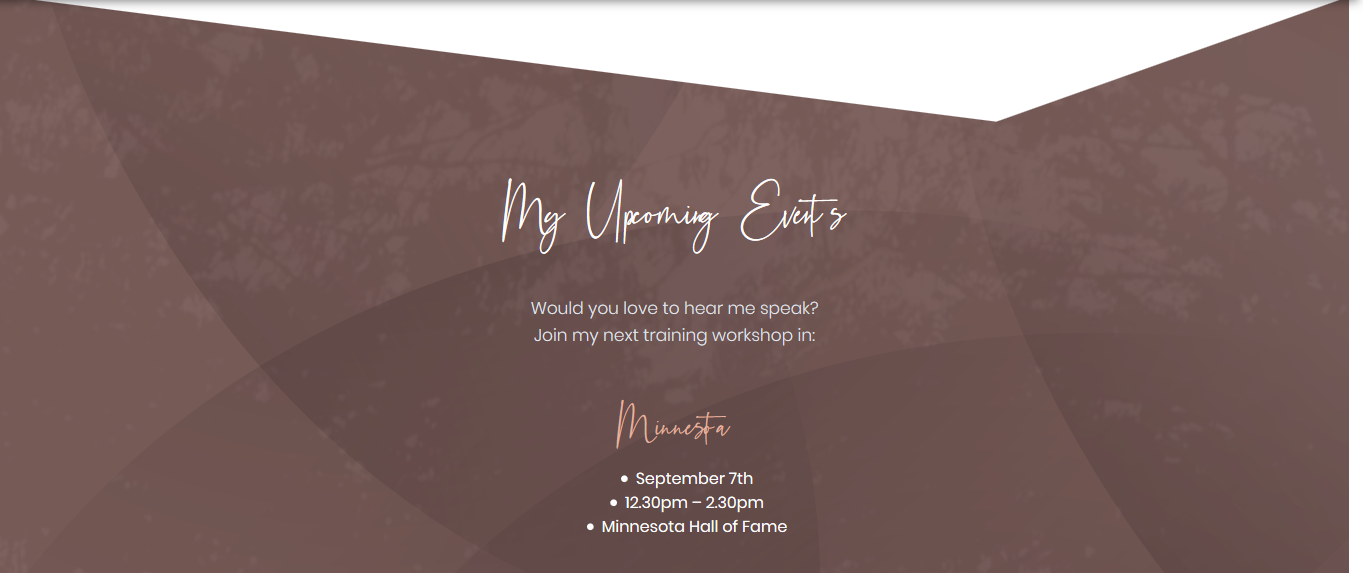
6. Background Graphic
- Wondering how you can change this graphic circled below?
- It is just a simple image
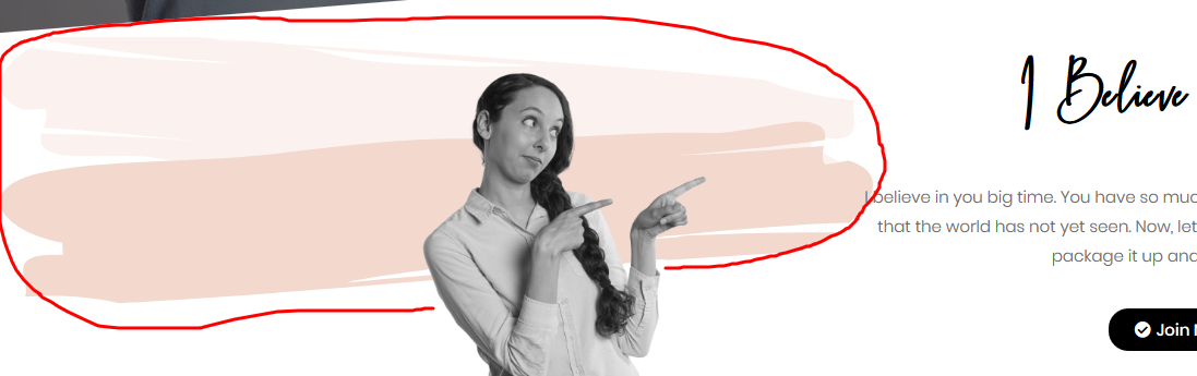
- To change it, hover your mouse over the top center of that section and click on the section editor handle
- Click on STYLE
- Click on BACKGROUND OVERLAY
- Click on the image to select a new one from your media library or from your computer
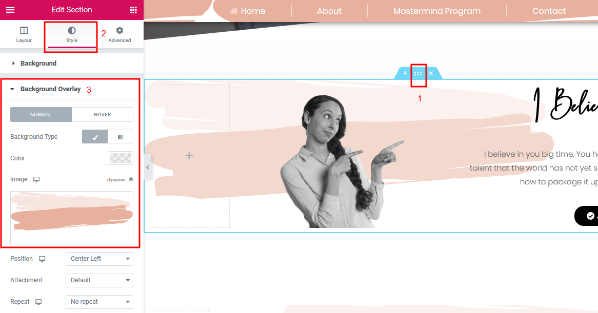
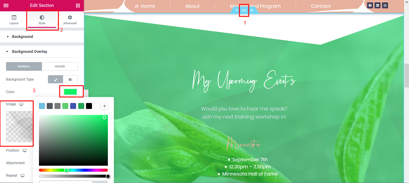
7. Section Background Properties
- To change the background image/color of this section here:
- Hover over the top center of the image and click on the section editor handle
- Click on STYLE
- Click on BACKGROUND to change the main image that shows in that section
- Change the OVERLAY in the BACKGROUND OVERLAY tab
8. Reposition Text
- You can literally drag and drop this text here to any other place on this page
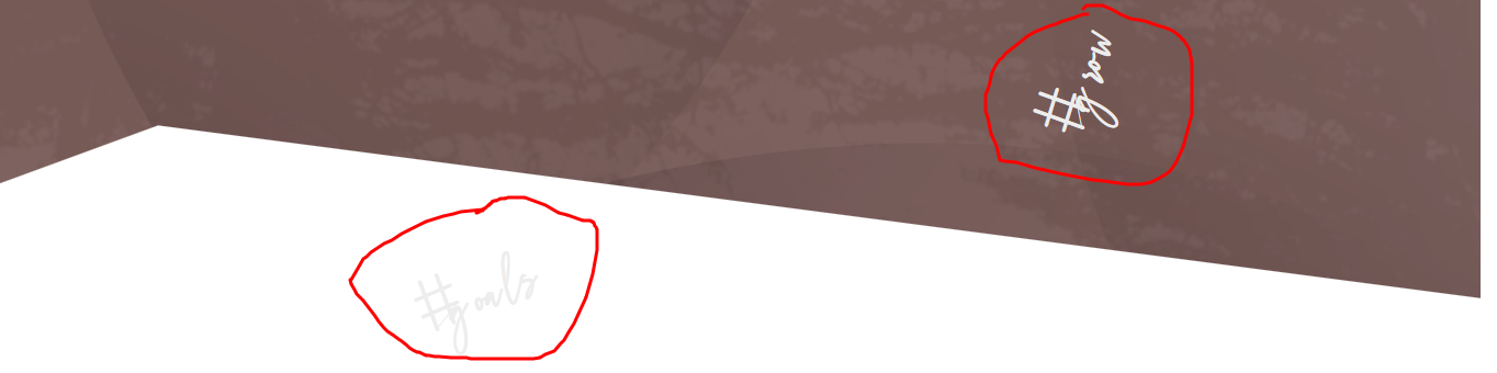
- Whilst pressing your mouse pad`s left key, simply click and reposition the text to where you want
- This is called absolute positioning
- Note, absolute positioning is not highly recommended for good, responsive designing and should not be overly used
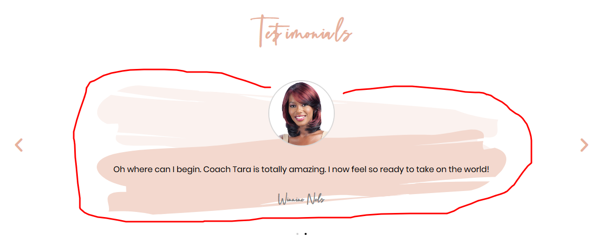
9. Testimonial Carousel
- The Testimonial Carousel widget lets you display a sliding carousel of customer testimonials in a variety of designs.
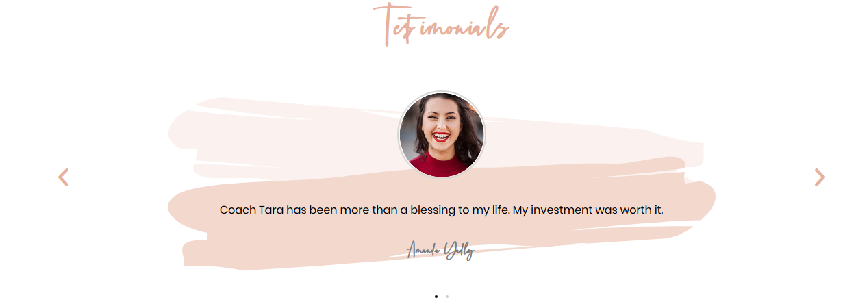
And here are the options available for the Testimonial Carousel
Content
Slides
Items
Shows a list of all the items in the slide. You can drag and drop them to change their order. Click on the Add Item button to add another item to the list.
Tip: Quickly duplicate or delete items by clicking an item’s Duplicate or Delete icon.
- Content: Enter the text of the testimonial
- Image: Upload or choose an image from the media library
- Name: Enter the customer’s name
- Title: Enter the customer’s title
- Skin: Select a pre-designed skin, either Default or Bubble
- Layout: Choose from Image Inline, Image Stacked, Image Above, Image Left, Image Right
- Alignment: Align the testimonial to the left, center or right
- Slides Per View: Select the number of slides to show at one time, from 1 to 10
- Slides To Scroll: Select how many slides to scroll per swipe, from 1 to 10
- Width: Set the width of the widget
Additional Options:
- Arrows: Show or hide the navigation arrows
- Pagination: Select the carousel pagination style, either None, Dots, Fraction, or Progress
- Transition Duration: Set the time between slide movement, in milliseconds
- Autoplay: Slide to YES to have the carousel slide automatically
- Autoplay Speed: Set the speed at which the carousel will slide, in milliseconds
- Infinite Loop: Set to YES to have the carousel continue sliding, infinitely
- Pause on Interaction: Set to YES to have the autoplay pause when the carousel is hovered over with a mouse or clicked
- Image Size: Set the size of the image, from thumbnail to full, or enter a custom size
Style
Slides
- Space Between: Control the space between the slides
- Background Color: Choose the background color of the slides
- Border Size: Set the thickness of the border around each slide
- Border Radius: Set the border-radius to control corner roundness
- Border Color: Choose a color for the border
- Padding: Set the padding within the border of each slide
Content
- Gap: Control the space between the image and the testimonial text
- Text Color: Choose the color of the testimonial text
- Typography: Change the typography options for the testimonial text
Name
- Text Color: Choose the color of the name
- Typography: Change the typography options for the name
Title
- Text Color: Choose the color of the title
- Typography: Change the typography options for the title
Image
- Size: Adjust the size of the image
- Gap: If Image Inline is selected, the gap controls the space between the image and the name and title
- Border: Slide to YES to place a border around the image
- Border Color: If Border is set to YES, choose the color of the border
- Border Width: If Border is set to YES, set the thickness of the border around the image
- Border Radius: Set the border radius to control corner roundness. This option is available even if Border is set to NO
Navigation
Arrows
- Size: Adjust the size of the navigation arrows
- Color: Choose the color of the navigation arrows
Pagination
- Size: Adjust the size of the pagination
- Color: Choose the color of the pagination
Bubble (Options only available if using Bubble skin)
- Background Color: Choose the color of the bubble’s background
- Padding: Set the padding within the bubble
- Border Radius: Set the border-radius to control corner roundness. This option is available even if Border is set to NO.
- Border: Slide to YES to place a border around the bubble
- Border Color: If Border is set to YES, choose the color of the border
- Border Width: If Border is set to YES, set the thickness of the border around the bubble
Note: Autoplay is affected by Google's Autoplay policy on Chrome browsers.
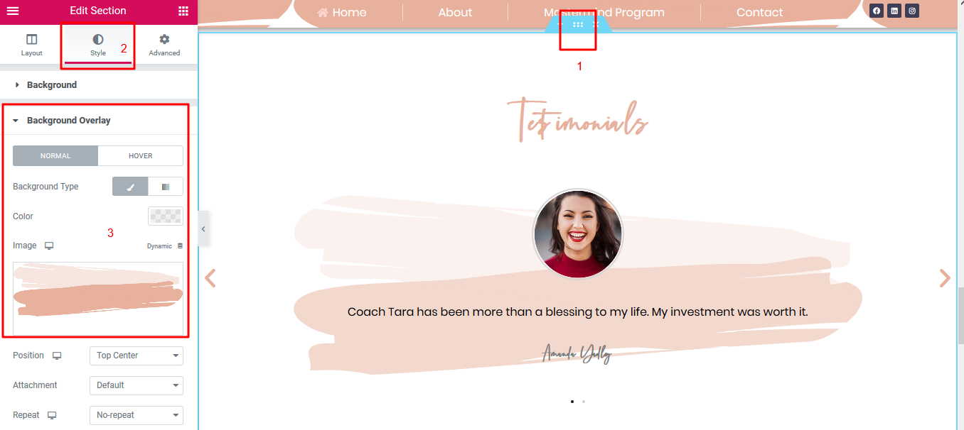
10. Testimonial Background
You can change the background image of the Testimonial Carousel
- To change the image, hover over the top center of the section and click on the section editor handle
- Click on STYLE
- Change your image from the BACKGROUND OVERLAY section shown below