E-Commerce Website & Brand Direction
Hair Max
Two Sisters, Two Palettes and a Store That Had Room for Both
- Client
-
- Year
- 2024
- Role
- Brand direction, e-commerce design and build
- Deliverables
- Custom e-commerce storefront, catalogue filtering and daily backup restoration
The Problem
Sisters Hailey and Monique were already selling high-quality wigs, weaves and frontal bundles, yet every order ran out of their backyard garage without a proper online sales point. Handling stock questions, bundle lengths and payments manually was cumbersome, and it held back a product line ready for a wider audience.
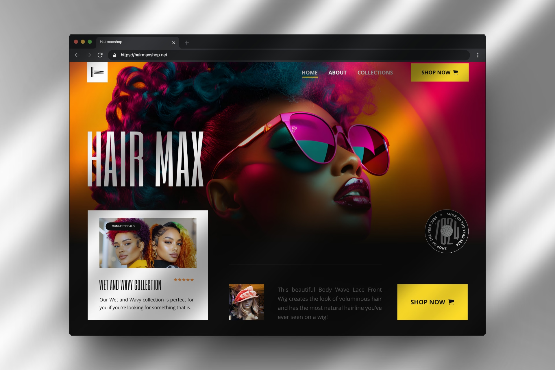
When they came to us for a custom e-commerce website, they brought two very different creative instincts to the table. Hailey wanted bold, high-energy colour that turned heads immediately, while Monique favoured a calm, editorial black-and-white look with a restrained touch of warm yellow or gold.
The Thinking
Both sisters had sound instincts, and our job was not to declare a winner. We wanted to build a store structure strong enough to hold either mood without compromise. Working with Hailey and Monique was genuinely enjoyable: they knew their hair textures inside out, brought clear opinions to every review, and turned every colour debate into a lively conversation.
On the studio side, Tinashe and Jane mapped out two distinct colour systems side by side. One explored a vibrant palette of crimson (`#D90452`), fuchsia (`#F205B3`), saffron (`#F2C029`) and orange (`#F27507`) against deep black (`#0D0D0D`). The other focused on an understated editorial palette of obsidian (`#0D0D0D`), soft off-white (`#F2F2F2`), warm terracotta (`#BF7F5A`) and muted gold (`#F2BD1D`).
For typography, we paired condensed display headers with Plus Jakarta Sans across product details and body copy. Its subtle glyph diversity and quiet warmth make bundle specifications easy to scan when shoppers are comparing lengths on their phones.
The Decision
After reviewing both prototypes together, we launched first with Hailey's bold, high-colour direction so the store could make a striking public debut. Monique graciously backed the launch even though her heart still leaned toward the quieter aesthetic.
Under the hood, we kept the e-commerce architecture clean and practical. We built category filters for weaves, frontal wigs and install care, bundle-pack length selectors, an interactive length visualiser, a slide-out studio bag with saved-for-later items, and automated daily server backups running quietly from day one.
The Outcome
The bold storefront served Hair Max well for its first three months online. Then Hailey and Monique returned with a familiar grin and a clear request: they were ready to switch to Monique's laid-back black, white and warm-gold aesthetic.
Because our hosting environment maintains automated daily backups and clean version snapshots, restoring that direction was straightforward and stress-free. It is the refined storefront live at hairmaxshop.net today, complete with quick-add bundle deals, promo code copying and wishlist saving.
This project reminded our studio how valuable it is to honour differing tastes on a founding team, and to build technical foundations flexible enough to evolve once a brand's voice settles.
The client may have updated the site since it launched, so it may look different from the visuals shown here.
