Brand Identity & Custom Website
Nanay
Local Flavors, Mother's Touch. Built to Outlast Any Feed.
- Client
-
- Year
- 2021
- Role
- Brand identity, visual direction and custom website build
- Deliverables
- Custom logo mark, colour system, booking website and visual gallery
The Problem
It began with a simple email in our inbox carrying the subject line "Help For My Mother". During the height of the pandemic, Nanay lost her husband, her partner in both life and business, leaving her with her loom, her ladle and her only daughter.
Her daughter wrote to tell us that Nanay was drifting into quiet grief, even though her hands were rarely still. She was still simmering traditional Filipino dishes in seasoned clay pots and weaving intricate patterns on her loom, yet her world had shrunk to the borders of her local barangay (community).
"Only our barangay knows what she does," her daughter explained, asking if we could help set up a Facebook page just to bring in a few extra guests and keep her mother occupied. Looking at the photographs attached to that message, from the steam rising off spiced clay-pot stews to the vibrant geometry of her handwoven runners, we realised a Facebook page was not enough. Her craft did not lack heart; it lacked visibility, structure and a permanent home of its own.
The Thinking
Rather than chasing passing design trends or generic restaurant templates, we looked directly at Nanay's kitchen and loom. Her brand already existed in the textures she touched every day, and our role was simply to translate them onto the screen with warmth and dignity.
From the photographs of her cooking and textiles, Tinashe and Jane sampled an earthy, grounded palette: deep terracotta (`#732B1A` and `#A64B37`) drawn from seasoned clay pots and floor tiles, mustard gold (`#BF7821` and `#D99152`) from hand-ground turmeric and golden fried lumpia, deep olive (`#59522F`) from banana-leaf plating, and warm unbleached cream (`#F4EFE6`) as a calm backdrop.
We also chose not to build a noisy, high-pressure restaurant portal. Nanay was not merely selling meals; she was carrying Filipino heritage forward. Every layout decision needed to give her portrait, her textiles and her recipes room to breathe so visitors felt invited into her table rather than rushed through a menu.
The Decision
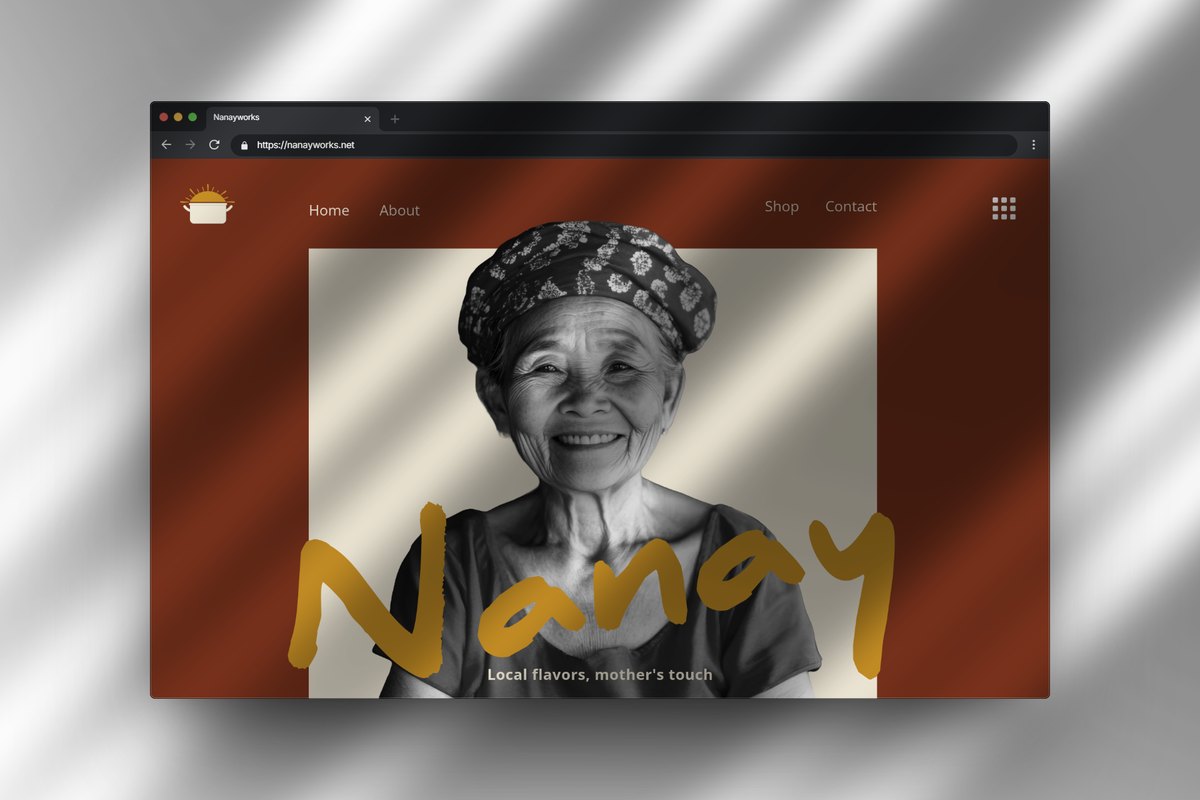
Instead of a fragile social media page that could vanish behind an algorithm change, we designed a complete brand identity and a custom website anchored around her signature tagline: "Local flavors, mother's touch." We crafted a friendly hand-lettered brush wordmark paired with a simple steaming cooking-pot emblem topped by warm golden rays, capturing both hospitality and morning warmth in a single mark.
We structured the site around three clear pillars: attraction, connection and conversion. Visitors meet Nanay through a monochrome editorial portrait framed against warm cream and terracotta, explore a curated gallery of her clay-pot dishes and handwoven fabrics, and use a straightforward booking and enquiry flow to reserve a table or place an order without confusion.
Behind the scenes, Jane and Brian worked closely with Nanay's daughter to organise recipes, family photographs and menu notes into clean sections, making sure the daughter could manage bookings effortlessly from her phone while Nanay focused on her kitchen and loom.
The Outcome
When we presented the completed website just seven days after that first email, Nanay's daughter wept. Nanay leaned forward and gently ran her hand across the screen, almost as if she were checking the weave of a freshly finished cloth.
Today, Nanay has a rooted, sustainable digital home that belongs entirely to her family. Her cooking and weaving are no longer confined to a single neighbourhood, and visitors arriving from anywhere can discover her story, admire her craft and book an experience directly.
