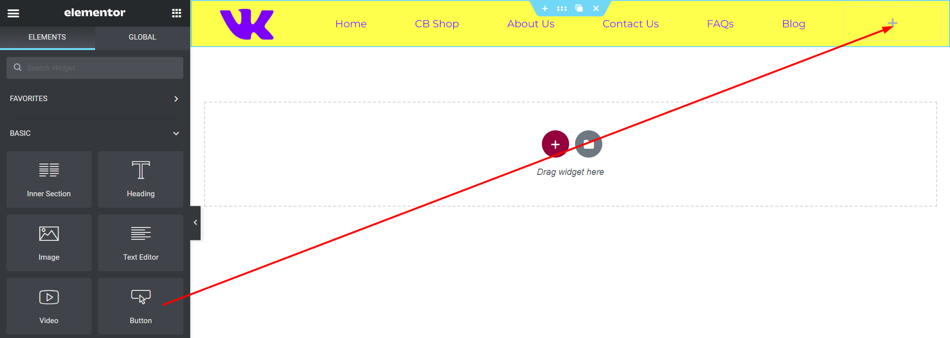
Do you want to add a button to your website header? Something like this:

- Adding a button in the header lets you create a more noticeable Call to Action.
- You may want to add a button that links to an online order form, a login or a sign-up page, or a buy now link - whatever you want!
- A button in the header gets more clicks to your most important pages and creates a better user experience by helping your visitors take action.
- In this short article, we’ll show you how to easily add such a button to your header menu.
Step 1: Login To Your Website
- To login to your website all you need to do is add /login/ or /admin/ to the end of your site's URL. Both of these URLs will take you to your login page where you can enter your username and password.
For example:
www.example.com/admin/www.example.com/login/ |
- Don’t forget to replace ‘example.com’ with your own domain name.
- Again, both of these URLs will redirect you to the login page.

- If for some reason, your WordPress login URL is not working properly, then you can easily access the WordPress login page by going to this URL:
www.example.com/wp-login.php |
- Get in touch with us if you have forgotten your username and or password and we will reset these login credentials for you.
Step 2: Open The Header
- Now that you have logged in, open the current header of the website so you can begin editing it.
- Go to any page of your website and at the top of the page, hover over 'Edit With Elementor' and click on the header link below. This header link is usually named 'Header Sitewide' but can be named differently depending on the website. It can be named just 'Header' or 'HS' or anything along those lines:

Step 3. Add The Button
- Once you have clicked 'Edit With Elementor' you will now enter into Elementor Editor Mode so you can begin adding the button and designing it.
- Drag and drop the button widget from the left of your screen and place it in the appropriate section where you want the button to show.
- It is usually best to place buttons on the right of your header section as shown here:
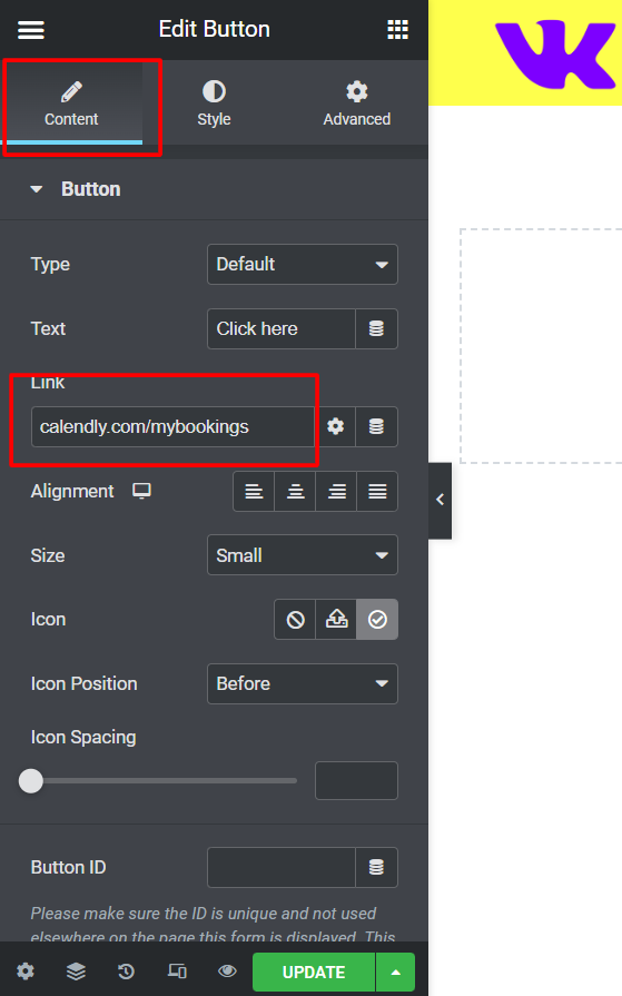
Step 4: Link the button
- In the Content section, simply paste the link to where you would like the user to be redirected when they click the button:
In case you are wondering what the several other settings in this Content section are, here is the full list of all the options and what you can optionally do with each one of them:
- Type: Select from 5 styles of buttons to begin your design. Choose from Default, Info, Success, Warning, or Danger
- Text: Enter the button’s text
- Link: Set the URL for the button’s link. Click the cog to set the link to either open in a new window or to add rel=nofollow to the link
- Alignment: Align the button to the left, center, right, or justified in relation to its column.
- Size: Select the preset button sizes, from Extra Small to Extra Large (see padding default details at the bottom of this document)
- Icon: Select a FontAwesome icon to display on the button
- Icon Position: Set the icon to appear before or after the button text
- Icon Spacing: Adjust the amount of space between the icon and the button text
- Button ID: (Optional) Assign a unique button ID to use for situations such as Google Analytics events
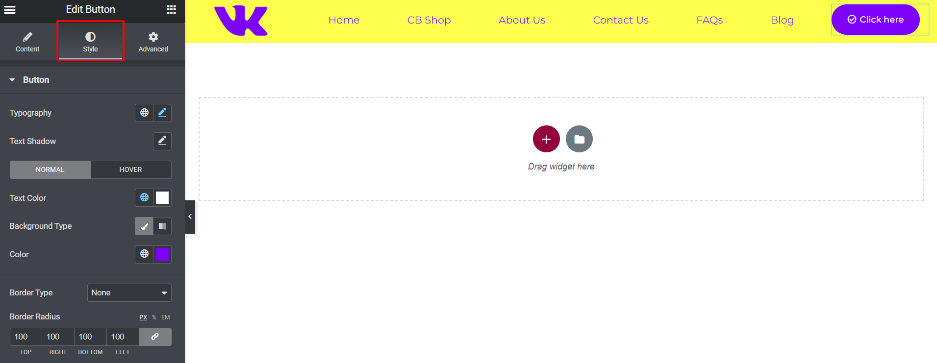
Step 5: Style The Button
- In the Style area, you can customize the Button Text Color and Background Color or make the button corners rounded.
In case you are wondering what the several other settings in this Content section are, here is the full list of all the options and what you can optionally do with each one of the options:
- Typography: Change the default typography options for the button’s text
- Text Shadow: Add a shadow and blur to the button’s text
- Text Color: Select the color of the button’s text
- Background Color: Select the button’s background color for both Normal and Hover states. You may use a solid or gradient color
- Hover Animation: Click on the Hover tab to set a Hover Animation
- Border Type: Select the type of border to use around the button
- Width: Control the thickness of the border around the button
- Color: Choose the border’s color
- Border Radius: Set the border-radius to control corner roundness
- Box Shadow: Set options to apply a box-shadow on the button
- Padding: Change the space around the button
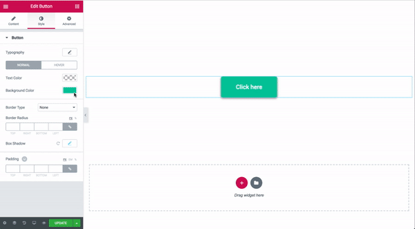
You can even style the button further and add a little hover animation as shown here:
That's all. Don’t forget to click on the green Update button at the lower left of your screen to save your changes.
Wasn’t that easy? :)
